27.11.10

MIT Media Lab


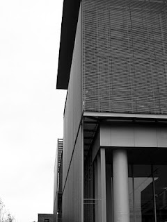
A good friend came to town a couple of weeks ago with his artist friend; i thought we would inspect the new MIT Media Lab and see what all the fuss was about.  So many rave reviews, and at work i was working on a project where we chased the manufacturer of the metal panel used at the Media Lab to use on our project.  Turns out we couldn't afford it, but we found another manufacturer that made a cheap copy...i thought i should see what the original looked like.

The MIT Media Lab is an interesting institution.  It gathers in one place scientists, designers, artists, and engineers and seeks to apply cutting edge theory and engineering exploration to the problems of everyday life, and anticipate those of the future, from transportation to the clothing we wear.  The Media Lab was looking to expand their facilities in the late 90's, but the .com bust slowed the project until its construction restarted a couple of years ago.  The project brief was for a facility that promoted interaction/connectivity not only between disciplines but with the outside world.

Fumihiko Maki, the Pritzker Prize winning architect, addressed the brief by creating a series of stacked atria one discovers after arriving in one of the two large atria that take up the south side of the building.  It sounds interesting, a series of stacked double height spaces one moves through as one moves through the building, but the result is less interesting than the promise.
The building has no center.  Each entrance has its own atrium, though i suppose the triple height one on the west side can be considered the dominant one, but in the end i was bored after passing through double height space after double height space, with no hierarchy or choreography to the movement through the spaces.  There's no drama to moving through this building, because upon entrance one has landed in one of the dominant spaces, and one will pass by or through many more to come.  Its not that they aren't pleasant; the main entrance atrium is a nice enough space, but nothing special.  Much has been made of the detailing, which is fine, but i tried to find the idea it was in the service of, and had a hard time finding evidence of one. i found things to be a bit precious and tiring; back of house doors had fancy steel plate details that my current project couldn't afford even one of, and was this a research facility or a some fancy-butt gallery?  What has happened to research that needed no more than those non de-script buildings of MIT's war and post war years to develop radar and explore the edges of physics, but now seems to need glazed guardrails and architectural detailing normally reserved for art institutions and Scandinavian embassies?  Why the bullshit?  It looks to me like misplaced priorities.  i wish the building did more to express the nature of the study going on in these labs.  i wish there was space that shared the character of the magic that these people seem to be engaged in, spaces that interlocked but did so without holding hands, did so with surprise and chiaroscuro, where one passed through tight spaces or corridors to find expansive lab space that soared above, where the connectivity wasn't always the path one walked, but could at times be a beam of light with origins in another space that was unreachable.  Why couldn't the space be more like the Stata Center space?  So many critics have fawned over this project; clearly i don't get it.

One has to keep in mind that Maki is a Japanese architect.  What i've written above has a Western bias that seeks a reference to center in any spacial arrangement.  But this is not the way space is made in Japan, or the way its been thought about thought their history.  If our notions of center are to be found in our monotheistic religions, the Japanese can be excused for not engaging in this kind of silliness.  Their religion, and their way of thinking, doesn't center the way we center.  Theirs is a decentralized center of sorts, a center that one carries with one as one moves through life, as one moves through the city, as one moves through the garden, or as one moves through the temple.  The center is where you are.  You are the center; it doesn't exist outside your experience of it, or it can be said to exist wherever your gaze takes you.  God is everywhere.  Maki's building is a perfect example of this; there is no defined center, all are defined centers.  There is a simultaneity about the spaces that declares no ruler, for the visitor is the ruler, and center exists with them.  It is inexplicable to the Western critic, just as is the space of Japanese architecture.  We cannot apply our measures to it and hope to find understanding, unless we are first willing to understand them.

Metal panel and tube screening


Close up of tube screen

Upper atrium; main entrance atrium is just off to right

Upper level hang out zone

Upper level function room.  The white carpet is already filthy

Not beautiful.  But the detailing...

6.11.10

Crank Sturgeon


Back in the corner of your music appreciation room sits a lonely child playing with her chest hair & trumpets.  Not many pay attention to this child, to the child's delight, but there are some who find pleasure in the sounds of the back corner.  eye am juan.

If you aren't familiar, i throw a quick definition: noise is music minus the "rules" of music, though many in the corner find it fun to insert a sniff of melody, a pounding that reminds of rhythm, or voice whaling New Bedford.

The noise scene, however, has long been dominated by those enthralled with imagery most originally conjured in the late '70s by the band Throbbing Gristle, who were most interested in shining their light on the underside of society, and did their best to articulate the hypocrisy they saw through the display of crime scene footage, disections, and other visions of darkness during their performances.  30 years down the road, this display by lesser acts than Throbbing Gristle is, to put it mildly, tired.  Actually, its been tired for at least 20 years.  i can't tell how many performances i've seen where someone dressed in black (what else?) sits in front of a audience tinkering with obscure dials on a box while video footage is projected of napalm attack victims or some kitten having its tummy removed by a pit bull.  yawn.

There are, of course, exceptions.  Crank Sturgeon is an artist who's been performing since the mid 90's, but on a path that expands the definition of what "noise" is to include not just the sounds of noise but the phenomenal noise that exists between things that were never intended to be put together.  In this sense noise deals with the space between rather than the objects themselves, and so favors the medium of space and sound as its primary voice.  But the Crank version of noise includes not just the sonic, not just the sound of his homemade instruments and contact mic's, but the visual as well.  Crank Sturgeon performances are as much vaudeville as rock show, infused as they are with humor, irreverence, comment, and intelligence.  A summary, i think, of all that noise should lay claim to, but so rarely does.


His most recent performance was at the annual Sacred and Profane festival held at Peaks Island, Maine, in a concrete military bunker originally constructed to protect the east coast during WWII.  From the roof of the bunker, Crank suspended an airplane of sorts, sheathed in cardboard homeless signs, many donated by the homeless of Portland, of which there are many during this distressed time.  His sad plane swung back and forth, teetering and twirling, going nowhere, and sounding many a sputter as he sang a song of our world, and showed to all the unmistakable state of things.  That this performance was set in a military hall was all the more poignant, given the obscene excess of our military spending while so many do with so little.


27.10.10

art ramble

We, as a species, have declared ourselves to be the most clever of all the species wandering this planet.  No doubt we are on top of everything.  Not only are we are the only species to yodel with knickers glowing, but we're also the only species to make art.  And so i wonder; if we are the only species to make art, making it unique to ourselves, why is it such a struggle for us?  If it truly is in our nature, why do we wrestle with it so?  The collision here is with evidence that it's unique to ourselves and that it must therefore inform us about ourselves and our development, and with our difficulty in creating it, never mind defining it.  That art is the result of many collisions/intersections deep within the recesses of our evolution means only that the surface may be a facile one for our gaze in a moment of awareness, a flash of color and form or a sound that elicits a quick response that puts us in joy or dropkicks us into disappointment.  On its surface, we may see color, read words, hear melody, and follow dramatic action, but if we don't encounter meaning during our gaze, something that expands the experience beyond its immediate presence, we are likely to be disappointed, and that piece of art is unlikely to be held in high regard.

I've always thought art should be meaningful but felt that its primary objective was to subject us to beauty, not from afar, but from within, for in beauty is proof that we belong to the rest of the planet and that we are not some being apart from nature, but rather another piece of it, no more or less special than any other.  If we could create beauty, giving forth to us the same wonder and awe we experience in the landscapes and creatures around us, we would have verification that we do indeed belong, though we may have referred to this beauty in other terms, such as putting us closer to the divine.

After reading "The Art Instinct" by Dennis Dutton, i've come to believe that meaning is likely more important than beauty, no matter the definition of beauty.  This book made me realize that the artist is what interests us (historically) in art more so that the work itself, a concept that turned all i thought i knew about art on its head.  i always held that the Work has an objective distance from its creator, since in the end it must exist on its own, without the presence of the artist to prop it up with obscure intents and motivations.  A careful study of art history reveals that it is the ability of art to inform of its age and its creator that holds our attention over time, and that art with only beauty to sustain itself fails to engage our attention through history.  Mr. Dutton articulates this through his study of forgeries, noting that there have been many through time, many of them so brilliantly produced that they left little doubt among experts to be true "Vermeer's" or "Rembrandt's".  Yet when they are found to be forgeries they are discarded, no matter their beauty, for they cannot tell the story that we need to be told, or fit into the puzzle that is the era of their production.  We need art to tell us about ourselves more than we need it for the pleasure of its experience.  It is, over time, the only mirror we have, and if we find beauty alongside the insight and information it gives us, so much the better.

Excuse the lack of picture.  Imagine a dandylion stuck between a little boy's toes, with bees swirling and the windmill on fire.

12.10.10

Big Bambu


The Starn Brothers have an installation on the roof of the Metropolitan Museum of Art in New York that consists of a hive of bamboo lashed together in an ongoing construction that one is able to wander through.

The project takes a natural weed, bamboo, and cuts it, moves it, lashes it, and fashions it into something belonging to "us", and in doing so appears to summarize our time on earth.  A project doesn't have to do much more than that, does it?  It is abstract, fundamental to its core, and brings us face to face with our origins, and perhaps the origins of art itself.  That it speaks to shelter, a making of place, creative use of naturally occurring materials, and displays our ability to imagine makes it a significant articulation of all that should embody art, without bending to current fashion.  That it crowns a museum devoted to the history of art seems all the more fitting, as does the concept of the work; that of a work in progress that the visitor, at the moment of ones visit, experiences to be a whole work, but is only a slice in time of a much longer period that can only be understood with the passage of time, just as those in the museum below, subjected to thousands of years of changing attitudes over just what is "good art".


29.9.10

Gentlemen of Bacongo


Author Daniele Tamagni has just published a book about the fashionable men of Brazzaville, in the Republic of Congo.  In an earlier version of this piece I mistakenly associated the Republic of Congo with the Democratic Republic of Congo.  Though they are neighboring countries with similar names, they are different places with different histories.  Though the Republic of Congo is run by a dictator who holds elections with quotation marks around it, its civil war passed 10 years ago.  Not so in the Democratic Republic of Congo, which is deep in a civil war that seems to go on with no end, and where atrocities are regularly commited against the civilian population, such as mass rape used as a weapon to spread terror in the civilian population.  But this book isn't about corruption or civil wars.  Its about Dandies.

What is a Dandy?  Charles Baudelaire, credited with being the first to equate modernism with artifice and decadence,  favored decadence and the rule of the self over virtue, which he considered to be outside our natural state and therefore artificial.  He came to value the articulation of fancy for fancy's sake, for being devoid of purpose it would be but an articulation of itself; completely self referential.  This was the Dandy.  For Baudelaire, the Dandy had no "profession other than elegance, no other status but that of cultivating the idea of beauty in their own persons...the Dandy must aspire to be sublime without interruption; he must live and sleep before a mirror (for Baudelaire, Le Grand Mirroir was a hotel he stayed at in Brussels, near the end of his life, where he kept a bat he captured from a graveyard and fed it bread and milk).

The reason for the Dandy was to express disgust for the ruling Aristocracy/Bourgeoisie through appropriating their manner and dress, but emptying it of its meaning through a lack of purpose.  The Dandy had little earned income, often living off inheritance, and lived a life similar to the closely related Bohemian, though arriving at this position of opposition from a very different angle.

Congolese men are said to have returned to Congo from France in the 20's dressed to the hilt, influenced by the fashion driven cult of La Sape, a modern version of the Dandy that favored flamboyance and theatricality.  These men of Brazzaville, dressed beyond their situations, have their origins in this cult of elegance, but in this poor town articulate a very different meaning; these men become lenses of sorts that magnify the poverty of their situation through the presence of their improbability.


photos © Daniele Tamagni

26.8.10

Channel Bloom

The Fort Point Channel is blooming with plastic flowers.  Sniffy creatures of discarded plastic detergent containers are appearing and disappearing with the rise and fall of the sea and lunar pull.  Bright colors remind of the spring fresh promise long forgotten and collide with the history of a harbor long soiled, but now back to life despite a much darker larger picture.  This display is courtesy of artist Tim Murdoch, whose previous work has explored the linkages/separations between belonging and not, inside and out, and our relationship to nature.

With tide high, this bloomy vanishes as if in night or winter, and reappears when the tide again lowers and as such it seems to be keeping time more than we ever notice with the quiet rising and dropping of the water.  It signifies, but does so on more than one level, as the reminder of waters rising and dropping is also a reminder that Tide agent of our clean undies has in the past left us with frothy waters and fish floating sideways.  That the harbor is now "clean" may be cause to bloom a flower, but the sign of Tide reminds that all is not well.


20.8.10

art e

Art seems to matter, and it doesn't matter.  It is, in general, scorned by many who don't do it as a trivial pursuit, one with no function other than to satisfy eyes, and a waste of money when it comes to government spending and priorities.  F-22 fighter jets are held in much higher regard. It does, though, bring pleasure even to those who aren't supporters of art, and there may be no households in the world that contain no art at all.  i've long believed that art was one of the first means of communication for this species, and continues to communicate ideas that fail words.  But it may be that art has a more fundamental role in our species, one necessary to our survival.  That is the premise behind the book "The Art Instinct" by Denis Dutton, which i highly recommend.

10.7.10

PAAM

The Provincetown Art Association and Museum recently expanded into a new addition to their historic longtime home on Commercial St., known as the Hargood House.  The new addition, by Machado & Silvetti Associates Architects, increases the amount of space for both the storage and display of art, as well as improved event facilities.


For all its progressive politics, Provincetown is artistically a conservative place, as any stroll down Commercial Street will prove with few exceptions.  Therefore, to see such a modern effort in this home for art is welcome, and overall the building is successful.  i like to think of it as a "nice" building; its pleasing to the eye and is, for the most part, obedient.  Is this the right place for an art building to play obedience?  With all the freaks trying to catch your eye here, and crotch, i wonder, but my guess is that the Town didn't want a freak.


The plan is straightforward, as you can see below.  The Hargood House is on the right, housing the Moffett Gallery and fronting the large gallery and performance space behind.  The new entrance, in the new addition, steps back from the street just a bit from the House (containing the Moffett Gallery), allowing the House to fill a more dominant role on the street.  The circulation is straightforward; after entering at the Museum Store, one moves in either direction about the volume of the store, and experience both the old house and the new addition.  The dominant space is the Hofmann Gallery, with its tall volume, abundant light, and open trusses.  Its especially effective to discover this space when moving first through the low, darker spaces of the modern wing.


The elevations are the most successful aspect of the project, making references to local traditions of materials and methods of construction, but doing so in a modern idiom.  The project in this respect reminds me of the firm's Allston Library project, poor in layout and movement through space (this project is a bit better in that respect), but with an attractive facade displaying a clever use of materials.

The first floor is finished in board formed concrete, with large cedar "shingles" above making reference to a Cape standard, and above more wood but this time behaving as if clapboards, but in a way that allows for transparency.


Another reference made is to the proverbial bay window, here positioned on the facade in what would have been the center of the composition had it been "completed", but instead is left voided in deference to the Hargood House, and as a way to relate the new to the old volumetrically.   The bay windows turn out to be a mixed blessing, as their butt glazed elegance and near complete transparency allow glimpses to the upper level interiors, and seduce one into a visit to "see me, dahling.."  Well, that was the effect they had on me, but i suppose i'm easily seduced.


In fact, you cannot visit the upper levels.  Frustration!  They house a school and offices for the Association. What looks from below like very provocative spaces peeked at through the bays is not part of the museum, and upon entrance there is no stair at all.  The gallery is housed only on the first level, and is completely apart from anything above.  No double height space, no open stair to those rooms calling you from above.  The building is a pancake, and in this regard spatially banal, like one of those traditional houses it takes so many cues from.

There is also some very poor detailing at the entrance, which made me wonder if the clumsy gutter was tacked on during construction as an afterthought.  That the downspout is stuck onto the Hargood House i thought was humorous, being an odd and i think intentionally overt  crotch grab of Hargood to declare itself the new entrance.

20.6.10

faux toes

new page glanceit wire wire wire s

Balance


Balance is the latest installation piece by artists Dwayne Bohuslav and Joanne Brigham, who together perform as Moving Bodies.  Their art typically addresses the most primal aspects of our existence and that of our planet, here using the theme of vernal equinox for a show that opened on the date thereof.

Though their themes are often primal in nature, addressing topics such as ice, human instinct, myth, and habitation,  their palette of materials is a modern one that attempts to reconcile these ancient themes with our modern lives, and discourage our ever increasing distance from a life engaged with the planet.

Many of their pieces are designed by Bohuslav, who is also an architect, and occupied by Brigham for a performance of her sound works.  This synthesis of space making with occupation encourages comparisons to the primitive hut, which is furthered by the ad hoc quality of the workmanship and which again attempts to reconcile modern life with our roots, just as it first did in the writings of Laugier in the 18th century.  That the installations are opened as a performance, a movement from within, rather than object installed in space for our consumption as is typical, demonstrates to the viewer our connection to these themes by showing how they may be occupied.  Past themes have allowed for the art viewer to be art participant, as they were encouraged to walk through elevated constructions where they set off sonic constructions and lights through motion detectors.


This piece, Balance, while scoring the vernal equinox in its tilted frame, also took inspiration from the Japanese Tale of the  Bamboo Cutter, which tells of a baby girl found inside a bamboo shoot and ends with her return to the Moon, from which she originally came.  The story of  something/someone from the earth returning to the heavens is a common theme through the ages, and exemplifies  our desire to make sense of our place in the realm of things, and reconcile our life on this surface with the sky above.  The scale change in the Japanese story, from bamboo shoot to Moon in the heavens, is typical of Japanese philosophy that finds equality between the tiniest detail and largest gesture.  In the Bohuslav work, one finds a massive structure overhead giving birth to small suspended bottles, scaled to ones hand, and making sense of "balance".


Many of the works by Bohuslav and Brigham are suspended from above with the viewer passing beneath, so that present in these pieces are representatives of the earth and heavens, thereby posing a meeting of body and mind, instinct and learned, and in the end, an articulation of our presence on earth.

12.6.10

House Holman

It's not often that you're able to compare a painting with a work of architecture, but i thought i'd take the opportunity to do so with House Holman, constructed in 2004 near Sydney, Australia.


This house has received a lot of attention due to its dramatic siting, and its unusual for a house, even one with a substantial budget, to live up to such a site, much less to exceed it.  The house is perched on a 70 meter cliff overlooking the ocean in what is otherwise a completely unremarkable suburb.  You will never see pictures of this house from the street, because the house is sited so as to rid itself of its mundane neighbors.

The designers, Durbach Block Architects, have said the inspiration for the house came from "The Bathers", a painting by Picasso i was unfamiliar with.

"The Bathers" 1918

Picasso did another work called "The Bathers" in the '50s, but i see more of this painting in the house than the later piece, so i'm assuming it to be the painting from 1918.  Its easier to understand the link between the house and the painting if you see the plans:

Level 2

Level 1

The most notable feature of the painting is the composition of the figures.  Two of them are resting on the beach, and belong to it compositionally as their figures are mostly enveloped by the beach.  The third figure, by contrast, is standing and expressively enchanted with her visit to the beach, with arms undone and playing with her hair as she gazes upward .  She breaks the edge of the beach and that of the horizon, as if to express her joy as a limitless one, belonging more to the clouds than the earth, pointedly expressed here by her white striped bathing suit foretelling the clouds above.  Her suit is blue, and here again Picasso identifies her as belonging more to the sea and sky than the earth below.

House Holman, like the figures in the painting, is both anchored to the earth and fleeing to the sea and sky, as you can deduce by the plans above and the pictures below.  It seems also, i think, to express as much joy as the woman in the painting.

The beautiful, sinuous forms of the Living/Dining spaces (02, 03 in plans above), dancing on a couple of columns and extending to the sea and sky in two different directions, have a dual nature in that they also inform the inflected space below (10), carved into the earth/context below and referencing a cave in its form, so as to reconcile earth and sky.  This same spacial device is also used to define the courtyard space that leads to the pool, where the apparently free form of the living space is disciplined into a conforming part of a semi-circular formal court that appears to emerge from the edge of the cliff, along which one walks on the stepped approach from the pool, and again reconciling earth and sky; the nature of a cliff.

The approach to the court


Living space setting up the formal court to the right

Entrance from Courtyard

View from Kitchen to Courtyard

Sea and sky

7.6.10

The Plan

i thought i would add a sniff of my current favorite archy magazine, The Plan.  Its published in Italy, so its not cheap, and in fact i rarely buy it due to $18.50 a copy.  Thats because i'm stupid; its essentially a book and $18.50 is cheap for a book.

The project selection is always interesting, the drawings beautifully done, and there is a focus on how building are put together as well as the usual pretty pixies.  Czech it!

2.6.10

Packages 1

Every now and then, you run into packaging that strikes you as beautiful.  i remember thinking that Parkay (and maybe others used the same packaging) had a beautiful package concept, which had to do not with the graphics, but the package itself.  It opened in such a way as to foretell the delivery and shape of the item inside, which in this case was a stick of not butter.  i haven't seen this package in years, so i guess its been poofed.  The old style match boxes had a similar design, with a box within a box, one sliding with respect to the other, so as to embody a foretelling of the lighting of the match on the side of the exterior box, which i think is a beautifully simple, though most likely unnoticed, way of packaging matches.


Another favorite package is the Wiffle packaging for both ball and bat.

The problem, i imagine, wasn't an easy one to solve.  How to package a small round object with a thin object, 32 inches long?  The solution was brilliant.  A simple cardboard construction is placed at the end of the bat that is held in place by the friction created through the fitting of its (slightly smaller) hexagonal shape over the cylindrical form of the bat.

Hexagon to circle

This shape is then ingeniously cut along the folds of the hexagon to allow it to open and accommodate the larger "circle" of the ball, after which the cardboard returns to its original form of a hexagon to create closure.  The two differing diameters of bat and ball are reconciled through the manipulation of this single hexagon.  But thats not the end of it.  Even more excitement!  The cardboard, after returning to its hexagonal form, is now perforated on half the creases, with the intent that it be opened here in order to get the ball out.  After doing so, these "freed" ribs, through the nature of their geometry, can be bend down upon themselves so as to form a nest for the ball to sit in, against the back ribs which have remained upright.

Package, broken but showing closure of ball

Nest

At this point, a single person can put the ball in the nest, toss the ball into the air, and hit it with the bat.  In this brilliant packaging, the ball is reconciled with the bat, both prior to purchase and after, and from a formal standpoint, manifests that line, as bat, is but a series of many points (ball).  Nothing but clarity.  Now go out and play.

LinkWithin

Related Posts with Thumbnails