Showing posts with label Japanese architecture. Show all posts

17.6.17

21st Century Museum of Contemporary Art, Kanazawa


i recently had the chance to visit the 21st Century Museum of Contemporary Art in Kanazawa, by Pritzker Prize winner SANAA.  It's an interesting building for what it says both about modern art and Japanese architecture and culture.

The building is a circle in plan, meaning there is no facade in the traditional sense; it has an insistent neutrality being not only singular in form but also in material, here glass.  The glass perimeter has within it many rectangular volumes and one circular volume, varying in size and materiality, as some are voids and some solids.  Within these volumes are exhibition spaces, again either closed (opaque volumes) or open (as courtyards).  The building is roughly split in two, with the public free to enter the northern part of the building, the southern half is paid special exhibition.  The line between the two seems ambiguous and wandering in a way that leads to the belief that it's not a serious demarkation, just as one might understand the glass perimeter to be but a formality of separation between inside and outside, as you can see from the picture above.  With no line between free public and paid, one has the sense that the space is a free one to wander, until you come upon a rope barrier where it's made clear whether you paid or not.

Site Plan

Floor Plan
The notion of breaking down the barrier between inside and out is an ancient one with a strong presence in traditional Japanese architecture.  Exterior walls were often sliding screens (shoji) that when opened loosened the barrier between house and garden, just as the gate or opening in a wall one would often find between garden and the wilder landscape beyond.  The idea was not to dissolve the differences between the two, but that the differences be celebrated as a matter of design.  One was always understood as a rooted version of the other, not its replacement.  Similarly, in the SANAA plan, one understands the interior as a version of the larger city, minus all the warts and condensers and utility wires of the modern Japanese city beyond.  Present too is the Japanese characteristic of absent center, here playfully missing from the most insistent of forms, a circle. In an earlier post, we talked about that characteristic of the Japanese city and how the train station pretended as such but did so as center that expelled as much as it gathered, acting as a kind of anti-center.  This museum, with it's open stance with regard to access, does much the same, as people move about freely, coming and going, paying and not paying, 

Public corridor on north side cuts all the way through
As abstract as a red circle is for a nation of many islands, so the 21st Century Museum is as a building for the arts.  The entrance is a poke in the glass with a small canopy overhead, and the public entrance on the west side equally ambivalent about its role as portal to the glass circle.  The building does nothing to acknowledge the powerful sun that burns one side or another, and the shades that have been installed to mitigate that sun are an insult to the purity of the initial gesture; they're thin and must be pulled down one by one, and each is pulled differently, creating a chaotic appearance in a building with no tolerance for such.  It's also an affront to the ingenuity of traditional Japanese architecture, which was so attuned to the seasons and light. 

Late day sun can be blinding
The glass is often mirror
We architects like to assume that glass is transparent, but know that it often acts like a mirror.  The 21st Century Museum, like Japanese culture in general, moves as effortlessly from blinding light to shadow as it does transparent glass to mirror, and so the museum exists almost as much as it doesn't exist.  It's an enigma that plays with it's position between the precious Kenroku-en garden and Kanazawa Castle, where a wood house sits on a stone in a relationship equal to that of the garden and the landscape that preceded it.  At times it blurs as much the boundary between the sacred and profane as it does the boundary between inside and out.  At other times of the day, or the other "side" of the museum at the same time of day, it insists on this boundary by mirroring the city you're arriving from, making it's presence known from without.  In a similar "knowing from without", the island nation came to know itself as the Land of the Rising Sun, a reference to its perception from afar.

Permanent art installation Swimming Pool by Leandro Erlich
The light and the dark

30.1.13

Out House


Florian Busch Architects has recently completed a house of interesting proportions; 72 feet deep by 15 feet wide, of which the client said they wanted the house to be "open" to the exterior, so that they could  breathe in the middle of the dense city of Tokyo.  The solution is an interesting play with one of the most common features of urban housing, and simultaneously offers a commentary on Japanese notions of "place".

The architects made the not unreasonable decision to open the house to the sides, which given the length of the site seems to make sense, and which helps to alleviate the tube feeling such a site might be prone to.  Whats interesting is the device used to open the sides; as you can see from the image above, on the ground floor the north wall is open, on the second floor the south wall is open, and finally on the third floor the north wall is again open, this accomplished through the use of a folded cast in place concrete plate that weaves in and out.  This plate appears to be non committal as to whether it's a floor or a wall, as the thickness is cleverly maintained in both conditions.

It's important to note the proximity of the neighboring buildings in the image above; though not touching, they are very close, and their height makes them appear to be closer than their actual distance apart might be.  From this perspective, the folded plane might be considered a "party wall"* of sorts that has taken "both sides"; separating both the south and north buildings from each other and paradoxically creating a new "place" from this separation.  As such, the house has no formal reason for being; it is a wall, an apartness that claims both sides equally, but makes no claim of its own.  In this sense too, there is no unified living in this house.  Each fold is it's own claim with no sharing.  To move from one floor to another, one bores through the folded party wall:


The house has no place; it's a machine for borrowing, borrowing space from its unwitting neighbors.  This lack of centeredness, or more accurately occupying multiple centers, is a very Japanese tendency, as noted in an earlier post (Japan Musings 6) and by Roland Barthes in his book "Empire of Signs", where he discusses the role of the train station in Japanese cities (emptying center).  The "center" in this house is nothing more than the space one is currently occupying, and entirely consistent with Shinto tradition and, for that matter, the layout of Japanese cities themselves.  One is out when in, in when out.

The section is the elevation.


Nice use of curtains to separate space uses.
The curtains seem to be just a step removed from traditional Shoji screens.  They create a soft division of the long tubular space into the necessary uses.  Their transience is latent as opposed to that implied by the translucent glazing of the "open" sides of the house.

Bedroom

Roof Deck
All Photographs © Hiroyasu Sakaguchi AtoZ
*Party wall: A fire separation between two buildings that usually extends above the roof lines of each.

27.11.10

MIT Media Lab


A good friend came to town a couple of weeks ago with his artist friend; i thought we would inspect the new MIT Media Lab and see what all the fuss was about.  So many rave reviews, and at work i was working on a project where we chased the manufacturer of the metal panel used at the Media Lab to use on our project.  Turns out we couldn't afford it, but we found another manufacturer that made a cheap copy...i thought i should see what the original looked like.

The MIT Media Lab is an interesting institution.  It gathers in one place scientists, designers, artists, and engineers and seeks to apply cutting edge theory and engineering exploration to the problems of everyday life, and anticipate those of the future, from transportation to the clothing we wear.  The Media Lab was looking to expand their facilities in the late 90's, but the .com bust slowed the project until its construction restarted a couple of years ago.  The project brief was for a facility that promoted interaction/connectivity not only between disciplines but with the outside world.

Fumihiko Maki, the Pritzker Prize winning architect, addressed the brief by creating a series of stacked atria one discovers after arriving in one of the two large atria that take up the south side of the building.  It sounds interesting, a series of stacked double height spaces one moves through as one moves through the building, but the result is less interesting than the promise.
The building has no center.  Each entrance has its own atrium, though i suppose the triple height one on the west side can be considered the dominant one, but in the end i was bored after passing through double height space after double height space, with no hierarchy or choreography to the movement through the spaces.  There's no drama to moving through this building, because upon entrance one has landed in one of the dominant spaces, and one will pass by or through many more to come.  Its not that they aren't pleasant; the main entrance atrium is a nice enough space, but nothing special.  Much has been made of the detailing, which is fine, but i tried to find the idea it was in the service of, and had a hard time finding evidence of one. i found things to be a bit precious and tiring; back of house doors had fancy steel plate details that my current project couldn't afford even one of, and was this a research facility or a some fancy-butt gallery?  What has happened to research that needed no more than those non de-script buildings of MIT's war and post war years to develop radar and explore the edges of physics, but now seems to need glazed guardrails and architectural detailing normally reserved for art institutions and Scandinavian embassies?  Why the bullshit?  It looks to me like misplaced priorities.  i wish the building did more to express the nature of the study going on in these labs.  i wish there was space that shared the character of the magic that these people seem to be engaged in, spaces that interlocked but did so without holding hands, did so with surprise and chiaroscuro, where one passed through tight spaces or corridors to find expansive lab space that soared above, where the connectivity wasn't always the path one walked, but could at times be a beam of light with origins in another space that was unreachable.  Why couldn't the space be more like the Stata Center space?  So many critics have fawned over this project; clearly i don't get it.

One has to keep in mind that Maki is a Japanese architect.  What i've written above has a Western bias that seeks a reference to center in any spacial arrangement.  But this is not the way space is made in Japan, or the way its been thought about thought their history.  If our notions of center are to be found in our monotheistic religions, the Japanese can be excused for not engaging in this kind of silliness.  Their religion, and their way of thinking, doesn't center the way we center.  Theirs is a decentralized center of sorts, a center that one carries with one as one moves through life, as one moves through the city, as one moves through the garden, or as one moves through the temple.  The center is where you are.  You are the center; it doesn't exist outside your experience of it, or it can be said to exist wherever your gaze takes you.  God is everywhere.  Maki's building is a perfect example of this; there is no defined center, all are defined centers.  There is a simultaneity about the spaces that declares no ruler, for the visitor is the ruler, and center exists with them.  It is inexplicable to the Western critic, just as is the space of Japanese architecture.  We cannot apply our measures to it and hope to find understanding, unless we are first willing to understand them.

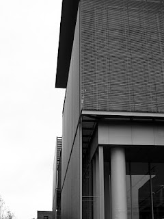
Metal panel and tube screening


Close up of tube screen

Upper atrium; main entrance atrium is just off to right

Upper level hang out zone

Upper level function room.  The white carpet is already filthy

Not beautiful.  But the detailing...

LinkWithin

Related Posts with Thumbnails