How much thought goes into a light switch? For most of us its a toggle switch, and its duty is to send electrons or not. But what if it's designed in such a way that it articulates its function of providing light or ending it? The switch above i found in a cheap hotel in Paris, and it does just that. The design is deceptively simple, with a chamfered face that brilliantly catches light on its upper face while the lower face remains in shadow. The switch itself teeters between the two faces, belonging to light or belonging to shadow depending on how its switched, as if awake or sleeping. The plane of the switch that doesn't become coplanar with one face of the plate becomes an interruption of the opposite face, disturbing the harmony of its light by catching it and throwing it back into the room as you can see above. The real beauty of the switch is less that it can be switched on and off than that it switches between light and dark.
30.7.11
Light ed
How much thought goes into a light switch? For most of us its a toggle switch, and its duty is to send electrons or not. But what if it's designed in such a way that it articulates its function of providing light or ending it? The switch above i found in a cheap hotel in Paris, and it does just that. The design is deceptively simple, with a chamfered face that brilliantly catches light on its upper face while the lower face remains in shadow. The switch itself teeters between the two faces, belonging to light or belonging to shadow depending on how its switched, as if awake or sleeping. The plane of the switch that doesn't become coplanar with one face of the plate becomes an interruption of the opposite face, disturbing the harmony of its light by catching it and throwing it back into the room as you can see above. The real beauty of the switch is less that it can be switched on and off than that it switches between light and dark.
21.5.11
Pop goes the music
i was in the gym trying to beef my tinies a bit when i looked up at the never-off tv screen and saw this video glowing. i tried to look away and check out some of the bulgy animal shanks that come out of peoples sleeves at my gym, but instead was transfixed by this video. i don't care for the music; i'm not into pop music, really, but the video, directed by Michel Gondry for Kylie Minogue, sucked on me eyeballs like they were mama teats. Its an amazing work on multiple levels.
i suppose the most obvious way the video transfixes is the technical aspect of showing a person appear with themselves over and over, but these days, you expect everything from a toothpaste commercial to the evening news to be swamped by effects, to the point that we're all numb from over-amazement (architecture, anyone?). i was more interested in the repetitive aspect of the spectacle and how it synched with the nature of pop music in general, such that it seemed as much a commentary on the genre as a product of the artist's PR desires.
The video begins with the camera following Ms Minogue as she leaves the dry cleaners in a very day to day outfit not fit for modern pop music flesh, unknowingly dropping a package just as she leaves, walking through a very working class suburb of Paris through crowds of "normal" people engaged in their own personal dramas and work, from a rider tumbling his motorcycle to a some poor guy getting kicked out of his girl's apartment, to workers posting adverts, a skateboarder, on and on, when the music comes to its refrain and you realize that she has walked a circle and has arrived back at the dry cleaners where she started, though now realizing she dropped her package picks it up, just as another Ms Minogue leaves the dry cleaners, dropping a package, and the song moves on through the refrain, over and over, with minor progressions to the goings on around her, but mostly repetitions and multiplications.
The idea that pop music is the soundtrack to our lives isn't new; this has probably been the case since the invention of radio, but its articulated here in a way that brings the glamor of imagined love and longing into the world of minor collisions and dropped packages. That the star herself appears without the decor required of fame and glamour (is her outfit at the dry cleaners?) returns the music to its foundation, which is the invisible public that purchases it and attends the shows when they can afford to do so. That she "completes a circle" is not just a metaphor for the repetitive structure of pop music, but appears as an attempt by the artist to synchronize the making of music to the act of listening to it, in effect to deny its ability to pass time, which ties it to one of pop music's residual characteristics, that being its ability to mark a moment for the generation to which it belonged in the form of nostalgia, a moment both frozen in time and lost.
i've long thought that the secret of pop music was its repetition, and that it was the repetition of elements that allowed songs to plant themselves in our skulls like memories we never had. You don't have to like a song for it to plant itself; its the constant exposure, the repetition not just of the song itself through the course of the day, but the repetition of catchy hooks and melodies that fish for our attention in an attempt to synch themselves to the other repetitions occurring throughout our minds and bodies. In Michel Gondry's video repetition is the medium, and the medium is the message. It's pop music about pop music about us, even as Ms Minogue sings that it's her world she wants (you) to visit, when its really ours.
30.4.11
Earth, sky, elderly housing
Last year saw the completion of an elderly housing project by Aires Mateus Architects in the town of Alcacer Do Sal, Portugal. This project is interesting on many levels beside its bold modern form, but i was most taken with its ability to document the essence of building and shelter, and do so for those at the end of their lives, in effect, distill these elements to their most abstracted forms, much as the end of the occupant's lives may be seen as summations of the lives they've lead.
i've seen this project described many times as a wall that emerges from the earth, but given the material palette, form, and coloring it seems to be doing something quite different; it seems instead to be a wall from the surface, belonging to the structures that make up the fairly clearly defined collection of buildings that are Alcacer Do Sal, acting as a form of definition that recalls earlier struggles to protect, defend, and define what it was to live in a town as opposed to not. That this project is elderly housing adds to the construct, as the collective nature of the project simultaneously gathers its occupants in an allusion to town square and moves them into the earth, though never away the village.
View Mateus_woof in a larger map
The nature of this collective is interesting. It's a wall, but an occupied one, one that alludes to the fortified city walls of the past but also to a variant of the modern inhabited wall, not so far removed from the "wall house" explorations of John Hejduk, though without the dynamism.
The model above shows how the proximity of detached structures to the project helps to proclaim the "wallness" of the Mateus project, as if there were occupied areas in need of protection or some need to define an inside or outside, belonging or not belonging, but the end effect is one of space/place making, and here lies the brilliance of the solution, which involves the coincident making of wall and clustered, semi-attached housing. The model, without articulation, appears to favor only the wall reading, and sure enough the view is from the "outside", the wall side of the project. As one can see from the plan below, there is definition of an exterior and interior in the organization, with the interior composed of occupied cells separated by notches, and the exterior, which is indeed wall, with tiny portals through which views to the exterior may be had. The differing articulation of interior and exterior is vital to understanding the conceptual origin of the composition as it's the difference between that which is alive and not. The exterior wall is literally wall, thick with material and providing the datum along which all circulation takes place, but with its chamfered edges behaves as if mimicking its occupied brethren on the other side of the corridor, as if speaking the same language though saying something quite different.
©Aires Mateus Architects
From the interior of the scheme, these notches have the visual effect of producing as much void as the compartments do solid, such that the "wall" is now equally mass and void, as much earth as it is sky, a phenomenal purgatory for those near the end of life.
![]() |
| as much void as solid |
![]() |
| beautiful dissolved corner |
![]() |
| View from the interior, "living" side of the wall. |
![]() |
| View from the outside, "wall" side of the wall. Solid here outweighs void. |
In this project are brought together earth and sky, shelter, and what it means to belong to one another. It speaks to the fundamentals of architecture in taking a wall and letting it differentiate not just interior from exterior but also define our relationship to both the earth and the sky, as well as youth to the elderly, and strangers to those we've known our whole life.
All color photography © Fernando Guerra FG+SG
In the end, the collective wall terminates in the earth, and here appears more sarcophagus than building roof. The vitality of life, so celebrated in town centers around the world and here in the gentle bend of a housing complex seen just beyond in the image above, terminates in a dark end of life.
23.1.11
Block 39 Belgrade
A competition for the Center for the Promotion of Science and the development of what is known as "Block 39" in Belgrade has been won by Architect Wolfgang Tschapeller. The competition involved the development of a whole block, but at the periphery is the Science Center rendered above, which serves the purpose of bringing science to the public through exhibitions in its large hall, here located well above ground, as is the building itself.
The intent is that of classic modernism, that the ground plane may be freed for circulation and plantings, and indeed the approach to this building anticipates just that, dominated as it is by ramps, stairs, and a cafe to provide for a "slow" procession to the building entrance above.
The idea of lifting a building up in the air isn't new; one could consider the Villa Savoie to be lifted above the ground plane, but it is more phenomenally lifted, as one does arrive at a ground floor, and the circulation path takes one through the house to the sky, so that the house ends up mediating between earth and sky. i also thought about Will Alsop's Sharp Center at the Ontario College of Art and Design in Toronto, which is the only example i know of a building so completely separated from the earth that its underside may be considered to be it's facade. The difference is that whereas Alsop's building is treated as a graphic object of sorts, with all sides treated equally, Tschapeller's design makes clear a facade that is the face of the building one approaches and the one given prominence above all others.
Sharp Center, Will Alsop
This all seems very new to me, and unprecedented. i'm sure there have been proposals that have elevated buildings above the ground plane, but i don't know of any that have been so clear about the space opened up by doing so. This is really a new space, one that has only recently become possible, and one that rethinks our relationship to the earth and space making in the city. The brilliance of the Tschapeller proposal is the deliberateness of the approach, one fully considered and choreographed as a procession rather than a shaft that launches one into the underside of the building as the Sharp Center does. The Science Center proposal is just as considerate of the plane below as it is to the surface of its underside, just as any well considered facade should be to its context and approach. The facade proposes a mirror finish, which here acts to reflect the earth in the sky, as if to remind of our true foundation even as we leave its territory, substituting one element for another but showing that we are, in the end, grounded.
That the space between is celebrated by a sheltered slow climb allows for a new consideration of the city itself; a 3-dimensionallity that we have yet to experience in our day to day movement through the city. We are used to moving about past the walls and down the corridors of our cities until we find our destination, but never have we been able to truly experience moving vertically through the same city. We take elevators, of course, but for the most part the vertical movement we experience takes place in a shaft under controlled circumstances. When the Eiffel Tower was completed in Paris at the end of the 19th century it was the first time people could experience this type of movement in the open air, but there it was in the service of entertainment, whereas the Tschapeller proposal envisions a whole city block created this way, with each entrance one that adopts a slow vertical rise into our occupied space, one accompanied by a gaze out to the city proper.
10.1.11
tree
Artist Greg Kowalski shows in this video that there is more than one way to photograph a tree. Its hard to say if this is a collage of many photographs or a video, which is of course a collection of many still images, but this capture seems to inhabit both worlds, moving and not, while showing us a tree while showing us something not a tree, so that our image of a tree is almost completely lacking in "treeness". What we get instead is information about something else, a displacement of sorts, so that the tree becomes little more than the medium for the message, a foreshadowing of its possible future as another medium of messages, as a sheet of paper.
Soundtrack: Sudden Infant
27.11.10
MIT Media Lab
A good friend came to town a couple of weeks ago with his artist friend; i thought we would inspect the new MIT Media Lab and see what all the fuss was about. So many rave reviews, and at work i was working on a project where we chased the manufacturer of the metal panel used at the Media Lab to use on our project. Turns out we couldn't afford it, but we found another manufacturer that made a cheap copy...i thought i should see what the original looked like.
The MIT Media Lab is an interesting institution. It gathers in one place scientists, designers, artists, and engineers and seeks to apply cutting edge theory and engineering exploration to the problems of everyday life, and anticipate those of the future, from transportation to the clothing we wear. The Media Lab was looking to expand their facilities in the late 90's, but the .com bust slowed the project until its construction restarted a couple of years ago. The project brief was for a facility that promoted interaction/connectivity not only between disciplines but with the outside world.
Fumihiko Maki, the Pritzker Prize winning architect, addressed the brief by creating a series of stacked atria one discovers after arriving in one of the two large atria that take up the south side of the building. It sounds interesting, a series of stacked double height spaces one moves through as one moves through the building, but the result is less interesting than the promise.
The building has no center. Each entrance has its own atrium, though i suppose the triple height one on the west side can be considered the dominant one, but in the end i was bored after passing through double height space after double height space, with no hierarchy or choreography to the movement through the spaces. There's no drama to moving through this building, because upon entrance one has landed in one of the dominant spaces, and one will pass by or through many more to come. Its not that they aren't pleasant; the main entrance atrium is a nice enough space, but nothing special. Much has been made of the detailing, which is fine, but i tried to find the idea it was in the service of, and had a hard time finding evidence of one. i found things to be a bit precious and tiring; back of house doors had fancy steel plate details that my current project couldn't afford even one of, and was this a research facility or a some fancy-butt gallery? What has happened to research that needed no more than those non de-script buildings of MIT's war and post war years to develop radar and explore the edges of physics, but now seems to need glazed guardrails and architectural detailing normally reserved for art institutions and Scandinavian embassies? Why the bullshit? It looks to me like misplaced priorities. i wish the building did more to express the nature of the study going on in these labs. i wish there was space that shared the character of the magic that these people seem to be engaged in, spaces that interlocked but did so without holding hands, did so with surprise and chiaroscuro, where one passed through tight spaces or corridors to find expansive lab space that soared above, where the connectivity wasn't always the path one walked, but could at times be a beam of light with origins in another space that was unreachable. Why couldn't the space be more like the Stata Center space? So many critics have fawned over this project; clearly i don't get it.
One has to keep in mind that Maki is a Japanese architect. What i've written above has a Western bias that seeks a reference to center in any spacial arrangement. But this is not the way space is made in Japan, or the way its been thought about thought their history. If our notions of center are to be found in our monotheistic religions, the Japanese can be excused for not engaging in this kind of silliness. Their religion, and their way of thinking, doesn't center the way we center. Theirs is a decentralized center of sorts, a center that one carries with one as one moves through life, as one moves through the city, as one moves through the garden, or as one moves through the temple. The center is where you are. You are the center; it doesn't exist outside your experience of it, or it can be said to exist wherever your gaze takes you. God is everywhere. Maki's building is a perfect example of this; there is no defined center, all are defined centers. There is a simultaneity about the spaces that declares no ruler, for the visitor is the ruler, and center exists with them. It is inexplicable to the Western critic, just as is the space of Japanese architecture. We cannot apply our measures to it and hope to find understanding, unless we are first willing to understand them.
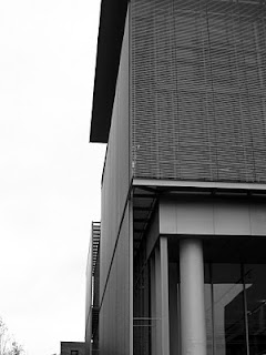
Metal panel and tube screening
Close up of tube screen
Upper atrium; main entrance atrium is just off to right
Upper level hang out zone
Upper level function room. The white carpet is already filthy
Not beautiful. But the detailing...
6.11.10
Crank Sturgeon
Back in the corner of your music appreciation room sits a lonely child playing with her chest hair & trumpets. Not many pay attention to this child, to the child's delight, but there are some who find pleasure in the sounds of the back corner. eye am juan.
If you aren't familiar, i throw a quick definition: noise is music minus the "rules" of music, though many in the corner find it fun to insert a sniff of melody, a pounding that reminds of rhythm, or voice whaling New Bedford.
The noise scene, however, has long been dominated by those enthralled with imagery most originally conjured in the late '70s by the band Throbbing Gristle, who were most interested in shining their light on the underside of society, and did their best to articulate the hypocrisy they saw through the display of crime scene footage, disections, and other visions of darkness during their performances. 30 years down the road, this display by lesser acts than Throbbing Gristle is, to put it mildly, tired. Actually, its been tired for at least 20 years. i can't tell how many performances i've seen where someone dressed in black (what else?) sits in front of a audience tinkering with obscure dials on a box while video footage is projected of napalm attack victims or some kitten having its tummy removed by a pit bull. yawn.
There are, of course, exceptions. Crank Sturgeon is an artist who's been performing since the mid 90's, but on a path that expands the definition of what "noise" is to include not just the sounds of noise but the phenomenal noise that exists between things that were never intended to be put together. In this sense noise deals with the space between rather than the objects themselves, and so favors the medium of space and sound as its primary voice. But the Crank version of noise includes not just the sonic, not just the sound of his homemade instruments and contact mic's, but the visual as well. Crank Sturgeon performances are as much vaudeville as rock show, infused as they are with humor, irreverence, comment, and intelligence. A summary, i think, of all that noise should lay claim to, but so rarely does.
His most recent performance was at the annual Sacred and Profane festival held at Peaks Island, Maine, in a concrete military bunker originally constructed to protect the east coast during WWII. From the roof of the bunker, Crank suspended an airplane of sorts, sheathed in cardboard homeless signs, many donated by the homeless of Portland, of which there are many during this distressed time. His sad plane swung back and forth, teetering and twirling, going nowhere, and sounding many a sputter as he sang a song of our world, and showed to all the unmistakable state of things. That this performance was set in a military hall was all the more poignant, given the obscene excess of our military spending while so many do with so little.
Subscribe to:
Posts (Atom)


.jpg)
.jpg)
.jpg)
.jpg)