25.9.11

Milstein Hall OMA

Ten years after Paul Milstein donated $10 million for a new addition to the Cornell Arts and Architecture building, and following a limited competition won by Steven Holl, Cornell has finally completed the addition to their Arts and Architecture building after having settled on OMA as their architect after stints with both Steven Holl and Barkow Leibinger.

i haven't yet visited the new facility, but intend to do so in the near future and add my own photos.  My initial impression is that this is wonderful architecture and as good as anything OMA / Rem Koolhaas has produced to date, and a lively yet sensitive addition to the Cornell campus and, most importantly, the Cornell Arts Quad, one of the most interesting college quadrangles in the country.

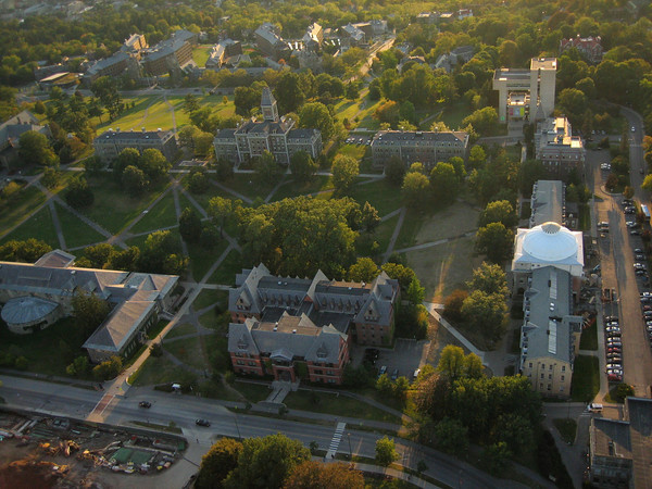
North end of the Arts Quad, with Sibley to the right.

The Arts Quad sits high on shelf near the top of a hill overlooking Ithaca and Cayuga Lake.  Like most traditional American college quads, it began as a series of buildings in a row, outside of town, that evolved into a grouping of buildings enclosing a large green.  The Cornell quad has large trees scattered about, and the buildings are far enough apart and the relationships between them such that space flows through the quad, much like a traditional New England town center green.  Sibley Hall, the Architecture building, sits at one end of the quad and is especially active in promoting the Arts Quad as a flowing, active space rather than a captured, static space, which you can get a sense of in the plan below:

Sibley in red, Rand in orange


Sibley Hall


The dominant feature of Sibley Hall is the central cubic volume topped with a dome.  It's now such a hallmark of Sibley that it's hard to imagine the quad without the Sibley dome at the north end, just off center, terminating the long green axis in a nudge to the east.  Yet there was a time when the dome wasn't part of the composition.  Originally, the north end of the Quad saw only what we now perceive as the wings of the dome, with a space between what was then East Sibley and West Sibley.  It wasn't until 1902 that the cubic auditorium and museum (now administrative offices) were built, tying the 2 wings together and creating a central, commanding presence on the Quad.  Somewhat paradoxically, and perhaps harkening to its engineering school origins, it's the very formal geometrically disciplined composition of the Sibley dome, a circle set within a square, a dome within a cube, that is set off axis of the Quad, creating the wonderful spacial effect of leaking the space out of the Quad and initiating movement across the gorge to the north campus.

The new Milstein Hall ingeniously comments on the Sibley history and it's role in the making of the modern Arts Quad.  It also behaves itself when it has to, not interrupting the flow of space along the face of Sibley out of the Quad, but aligning itself with Sibley on the south face while creating a new facade and gateway of sorts for those entering the Quad from the north.

Milstein as new entrance to Quad

Just as the Sibley dome filled in the interstitial space between two existing buildings to create a new center, so too does the new Milstein Hall, and does so using some of the same tools as the original Sibley dome, though in very different, modern, ways.  The two buildings now in question are Sibley Hall and the Architecture annex of studios in Rand Hall, an early 20th century industrial building with large steel windows where all the undergraduate architecture studios were housed, and lots of interesting undergraduate friskiness occured.  Most of the proposals from the other firms that have worked on this addition have razed Rand Hall, and one has to credit OMA for seeing the opportunity presented by keeping the structure just as it is.  

Insertion 1, Context, Insertion 2
The backside of Sibley has always been a backside, for many years the parking lot for the Arts and Architecture buildings, though it faces one of Cornell's great assets, the Fall Creek Gorge.  Milstein Hall now occupies that rear space, and does so in a way that extends the reach of the Arts Quad out behind Sibley, terminating it with the old sculpture foundry building (c 1860's).  In this sense, the Milstein addition is working within the interstitial space of 3 buildings, knitting them together as they have never been, and extending the space of the Quad to the edge of the Fall Creek Gorge, as you can see in the model below.

Rear view showing roof of Milstein terminating at the sculpture foundry.


Milstein and the old Foundry; Foundry becomes a Milstein elevation when seen from beneath the slab. 


i think many have questioned the space beneath the new Milstein, thinking of other modern attempts to glide cantilevers over the ground plane, often resulting in a dark and unpleasant space for the observer.  i don't think this will be the result here, and even if it is, i don't think it will be without having been considered.  Beneath the central dome and cubic volume of Sibley is a basement space that one enters from the Quad by going down a few steps.  This space is home to the Green Dragon, a cafe and meeting place for generations of art and architecture students (free coffee!).  It is a dark space with a low ceiling, very basement like, and cherished for its underground quality and murals of dragons past.  It has often been understood as an extension of the space of the Quad, as the windows sit at ground level, so that as one sits in the Dragon, gazing out the windows, one is viewing the ground plane of the Quad.  

As i've said above, Milstein Hall is in one way a reenactment of Sibley Hall.  The main difference in Act II is that Milstein has taken the central cubic volume of Sibley Hall and inverted it.  The dome is now an object sitting beneath a square volume of space that houses the studios and ties together the 3 buildings.  That the space beneath the square and around the "dome" has similarities to the Dragon can't be avoided; its a modern interpretation of course, as the space isn't a confined one, and its not literally a basement; its the ground plane, activated by the perversely subterranean dome.

N-S Section

View from the Dome, with Foundry beyond, not so unlike a Green Dragon.

Lower Level


Ground Level

Upper Level (Studio's)


Spacial link between Quad and north side of Sibley/gorge.

Rand Hall and new date.

Milstein and Foundry

Dome peek a boo

Bicycles parked alongside dome as if preparing for X-games.  Youth references abound.

Hard to see, but some y'onions are perched up top.  One of them lost grip on her cellphone and the sound of it sliding all the way down the dome could be heard throughout.  This space is a natural hangout.  It both declares itself apart and of the old man to the left.  You can bet which choice the kids will make.

View from opposite end.  i enjoyed the "tin" ceilings, a ubiquitous feature of these parts.

Mr. Sibley, meet Mr. Milstein..


As discussed, Milstein is a building with many interesting qualities, as are many others on the planet.  But this project goes a step further as the new home to the Architecture school at Cornell.  This building is a pedagogical player, behind the professors and fellow students, and as such has so many things to say about the profession and where it finds itself early in this century.  How does one make use of existing facilities while proposing new ones?  How does one add on to an existing building, respecting both history and this modern age?  What role does detail play in the language of building?  How does structure integrate itself into built form, or not?  How does one heat and cool a building dominated by glass walls?  The building doesn't always provide answers to its questions, but thats the point.

i found many lessons being given during my visit.
Entry level

Looking back at main entrance.  Interesting spandrel solution, if you can afford it.


Slab system intersection with dome

Studio level


The view from Rand, through Milstein.


30.7.11

Light ed


How much thought goes into a light switch?  For most of us its a toggle switch, and its duty is to send electrons or not.  But what if it's designed in such a way that it articulates its function of providing light or ending it?  The switch above i found in a cheap hotel in Paris, and it does just that.  The design is deceptively simple, with a chamfered face that brilliantly catches light on its upper face while the lower face remains in shadow.  The switch itself teeters between the two faces, belonging to light or belonging to shadow depending on how its switched, as if awake or sleeping.  The plane of the switch that doesn't become coplanar with one face of the plate becomes an interruption of the opposite face, disturbing the harmony of its light by catching it and throwing it back into the room as you can see above.  The real beauty of the switch is less that it can be switched on and off than that it switches between light and dark.


21.5.11

Pop goes the music


i was in the gym trying to beef my tinies a bit when i looked up at the never-off tv screen and saw this video glowing.  i tried to look away and check out some of the bulgy animal shanks that come out of peoples sleeves at my gym, but instead was transfixed by this video.   i don't care for the music; i'm not into pop music, really, but the video, directed by Michel Gondry for Kylie Minogue, sucked on me eyeballs like they were mama teats. Its an amazing work on multiple levels.

i suppose the most obvious way the video transfixes is the technical aspect of showing a person appear with themselves over and over, but these days, you expect everything from a toothpaste commercial to the evening news to be swamped by effects, to the point that we're all numb from over-amazement (architecture, anyone?).  i was more interested in the repetitive aspect of the spectacle and how it synched with the nature of pop music in general, such that it seemed as much a commentary on the genre as a product of the artist's PR desires.

The video begins with the camera following Ms Minogue as she leaves the dry cleaners in a very day to day outfit not fit for modern pop music flesh, unknowingly dropping a package just as she leaves, walking through a very working class suburb of Paris through crowds of "normal" people engaged in their own personal dramas and work, from a rider tumbling his motorcycle to a some poor guy getting kicked out of his girl's apartment, to workers posting adverts, a skateboarder, on and on, when the music comes to its refrain and you realize that she has walked a circle and has arrived back at the dry cleaners where she started, though now realizing she dropped her package picks it up, just as another Ms Minogue leaves the dry cleaners, dropping a package, and the song moves on through the refrain, over and over, with minor progressions to the goings on around her, but mostly repetitions and multiplications.

The idea that pop music is the soundtrack to our lives isn't new; this has probably been the case since the invention of radio, but its articulated here in a way that brings the glamor of imagined love and longing into the world of minor collisions and dropped packages.  That the star herself appears without the decor required of fame and glamour (is her outfit at the dry cleaners?) returns the music to its foundation, which is the invisible public that purchases it and attends the shows when they can afford to do so.  That she "completes a circle" is not just a metaphor for the repetitive structure of pop music, but appears as an attempt by the artist to synchronize the making of music to the act of listening to it, in effect to deny its ability to pass time, which ties it to one of pop music's residual characteristics, that being its ability to mark a moment for the generation to which it belonged in the form of nostalgia, a moment both frozen in time and lost.

i've long thought that the secret of pop music was its repetition, and that it was the repetition of elements that allowed songs to plant themselves in our skulls like memories we never had.  You don't have to like a song for it to plant itself; its the constant exposure, the repetition not just of the song itself through the course of the day, but the repetition of catchy hooks and melodies that fish for our attention in an attempt to synch themselves to the other repetitions occurring throughout our minds and bodies.  In Michel Gondry's video repetition is the medium, and the medium is the message.  It's pop music about pop music about us, even as Ms Minogue sings that it's her world she wants (you) to visit, when its really ours.

30.4.11

Earth, sky, elderly housing


Last year saw the completion of an elderly housing project by Aires Mateus Architects in the town of Alcacer Do Sal, Portugal.  This project is interesting on many levels beside its bold modern form, but i was most taken with its ability to document the essence of building and shelter, and do so for those at the end of their lives, in effect, distill these elements to their most abstracted forms, much as the end of the occupant's lives may be seen as summations of the lives they've lead.

i've seen this project described many times as a wall that emerges from the earth, but given the material palette, form, and coloring it seems to be doing something quite different; it seems instead to be a wall from the surface, belonging to the structures that make up the fairly clearly defined collection of buildings that are Alcacer Do Sal, acting as a form of definition that recalls earlier struggles to protect, defend, and define what it was to live in a town as opposed to not.  That this project is elderly housing adds to the construct, as the collective nature of the project simultaneously gathers its occupants in an allusion to town square and moves them into the earth, though never away the village.


View Mateus_woof in a larger map

The nature of this collective is interesting.  It's a wall, but an occupied one, one that alludes to the fortified city walls of the past but also to a variant of the modern inhabited wall, not so far removed from the "wall house" explorations of John Hejduk, though without the dynamism.


The model above shows how the proximity of detached structures to the project helps to proclaim the "wallness" of the Mateus project, as if there were occupied areas in need of protection or some need to define an inside or outside, belonging or not belonging, but the end effect is one of space/place making, and here lies the brilliance of the solution, which involves the coincident making of wall and clustered, semi-attached housing.  The model, without articulation, appears to favor only the wall reading, and sure enough the view is from the "outside", the wall side of the project.  As one can see from the plan below, there is definition of an exterior and interior in the organization, with the interior composed of occupied cells separated by notches, and the exterior, which is indeed wall, with tiny portals through which views to the exterior may be had.  The differing articulation of interior and exterior is vital to understanding the conceptual origin of the composition as it's the difference between that which is alive and not.  The exterior wall is literally wall, thick with material and providing the datum along which all circulation takes place, but with its chamfered edges behaves as if mimicking its occupied brethren on the other side of the corridor, as if speaking the same language though saying something quite different.

©Aires Mateus Architects

The chamfers of the occupied cells are but notches in the depth of this occupied belt, but they are space and bring light into the units, an ingenious device that allows the narrow deep units to receive much natural light.  On a formal level, these notches provide a vital reading into the origin of the wall, making reference to a previous circular or courtyard arrangement that has since been straightened or reconditioned to a new situation, one that can be seen as having given birth to the detached dwellings so near by.

From the interior of the scheme, these notches have the visual effect of producing as much void as the compartments do solid, such that the "wall" is now equally mass and void, as much earth as it is sky, a phenomenal purgatory for those near the end of life.

as much void as solid

beautiful dissolved corner


View from the interior, "living" side of the wall.

View from the outside, "wall" side of the wall.  Solid here outweighs void.


In this project are brought together earth and sky, shelter, and what it means to belong to one another. It speaks to the fundamentals of architecture in taking a wall and letting it differentiate not just interior from exterior but also define our relationship to both the earth and the sky, as well as youth to the elderly, and strangers to those we've known our whole life.

All color photography © Fernando Guerra FG+SG

In the end, the collective wall terminates in the earth, and here appears more sarcophagus than building roof.  The vitality of life, so celebrated in town centers around the world and here in the gentle bend of a housing complex seen just beyond in the image above, terminates in a dark end of life.


23.1.11

Block 39 Belgrade


A competition for the Center for the Promotion of Science and the development of what is known as "Block 39" in Belgrade has been won by Architect Wolfgang Tschapeller.  The competition involved the development of a whole block, but at the periphery is the Science Center rendered above, which serves the purpose of bringing science to the public through exhibitions in its large hall, here located well above ground, as is the building itself.

The intent is that of classic modernism, that the ground plane may be freed for circulation and plantings, and indeed the approach to this building anticipates just that, dominated as it is by ramps, stairs, and a cafe to provide for a "slow" procession to the building entrance above.

The idea of lifting a building up in the air isn't new; one could consider the Villa Savoie to be lifted above the ground plane, but it is more phenomenally lifted, as one does arrive at a ground floor, and the circulation path takes one through the house to the sky, so that the house ends up mediating between earth and sky.  i also thought about Will Alsop's Sharp Center at the Ontario College of Art and Design in Toronto, which is the only example i know of a building so completely separated from the earth that its underside may be considered to be it's facade.  The difference is that whereas Alsop's building is treated as a graphic object of sorts, with all sides treated equally, Tschapeller's design makes clear a facade that is the face of the building one approaches and the one given prominence above all others.

Sharp Center, Will Alsop

This all seems very new to me, and unprecedented.  i'm sure there have been proposals that have elevated buildings above the ground plane, but i don't know of any that have been so clear about the space opened up by doing so.  This is really a new space, one that has only recently become possible, and one that rethinks our relationship to the earth and space making in the city.  The brilliance of the Tschapeller proposal is the deliberateness of the approach, one fully considered and choreographed as a procession rather than a shaft that launches one into the underside of the building as the Sharp Center does.  The Science Center proposal is just as considerate of the plane below as it is to the surface of its underside, just as any well considered facade should be to its context and approach.  The facade proposes a mirror finish, which here acts to reflect the earth in the sky, as if to remind of our true foundation even as we leave its territory, substituting one element for another but showing that we are, in the end, grounded.


That the space between is celebrated by a sheltered slow climb allows for a new consideration of the city itself; a 3-dimensionallity that we have yet to experience in our day to day movement through the city.  We are used to moving about past the walls and down the corridors of our cities until we find our destination, but never have we been able to truly experience moving vertically through the same city.  We take elevators, of course, but for the most part the vertical movement we experience takes place in a shaft under controlled circumstances.  When the Eiffel Tower was completed in Paris at the end of the 19th century it was the first time people could experience this type of movement in the open air, but there it was in the service of entertainment, whereas the Tschapeller proposal envisions a whole city block created this way, with each entrance one that adopts a slow vertical rise into our occupied space, one accompanied by a gaze out to the city proper.

10.1.11

tree

Artist Greg Kowalski shows in this video that there is more than one way to photograph a tree.  Its hard to say if this is a collage of many photographs or a video, which is of course a collection of many still images, but this capture seems to inhabit both worlds, moving and not, while showing us a tree while showing us something not a tree, so that our image of a tree is almost completely lacking in "treeness".  What we get instead is information about something else, a displacement of sorts, so that the tree becomes little more than the medium for the message, a foreshadowing of its possible future as another medium of messages, as a sheet of paper.


Soundtrack: Sudden Infant

LinkWithin

Related Posts with Thumbnails